
Clayton Cotterell
An unconventional portfolio for a world-renowned photographer

Clayton Cotterell is a photographer and director based in Portland and Los Angeles, shooting for brands like Nike, Apple, Airbnb and The New York Times.
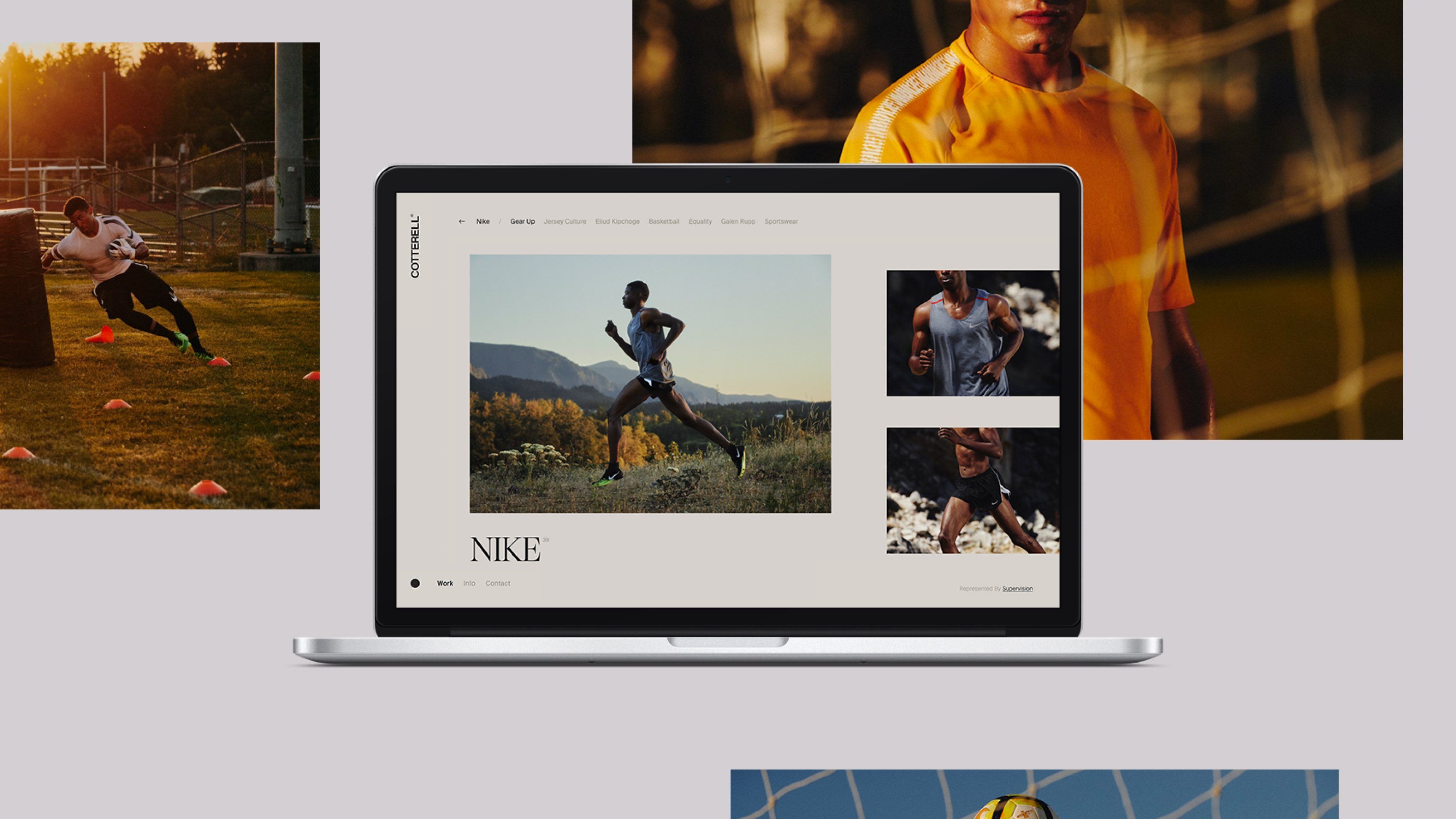
Most photography portfolios look the same. A grid of thumbnails, a lightbox and that’s it. Clayton thinks in sequences and spreads, always piecing together his next book, so we wanted his site to feel the same way. We designed a portfolio that reads more like a photo book than a website, where every project is laid out with its own rhythm of scale, spacing and pacing. Then we built the tools so Clayton could keep doing that himself.
The Grid
No two projects look alike. Each collection scrolls horizontally like flipping through a book, with images sized and placed to give them room to breathe. A big quiet moment here, a tight cluster of details there. It lets the work set the pace instead of a rigid template.
A CMS Built for a Photographer
A layout this custom usually means calling a developer every time you want to add a project. We didn’t want that for Clayton. We built a custom CMS in Sanity that gives him simple controls for each image, like scale, position and offset. A grid preview on the live site shows him exactly how a spread will sit as he builds it, so he can compose every project the way he’d lay out a book, without touching any code.
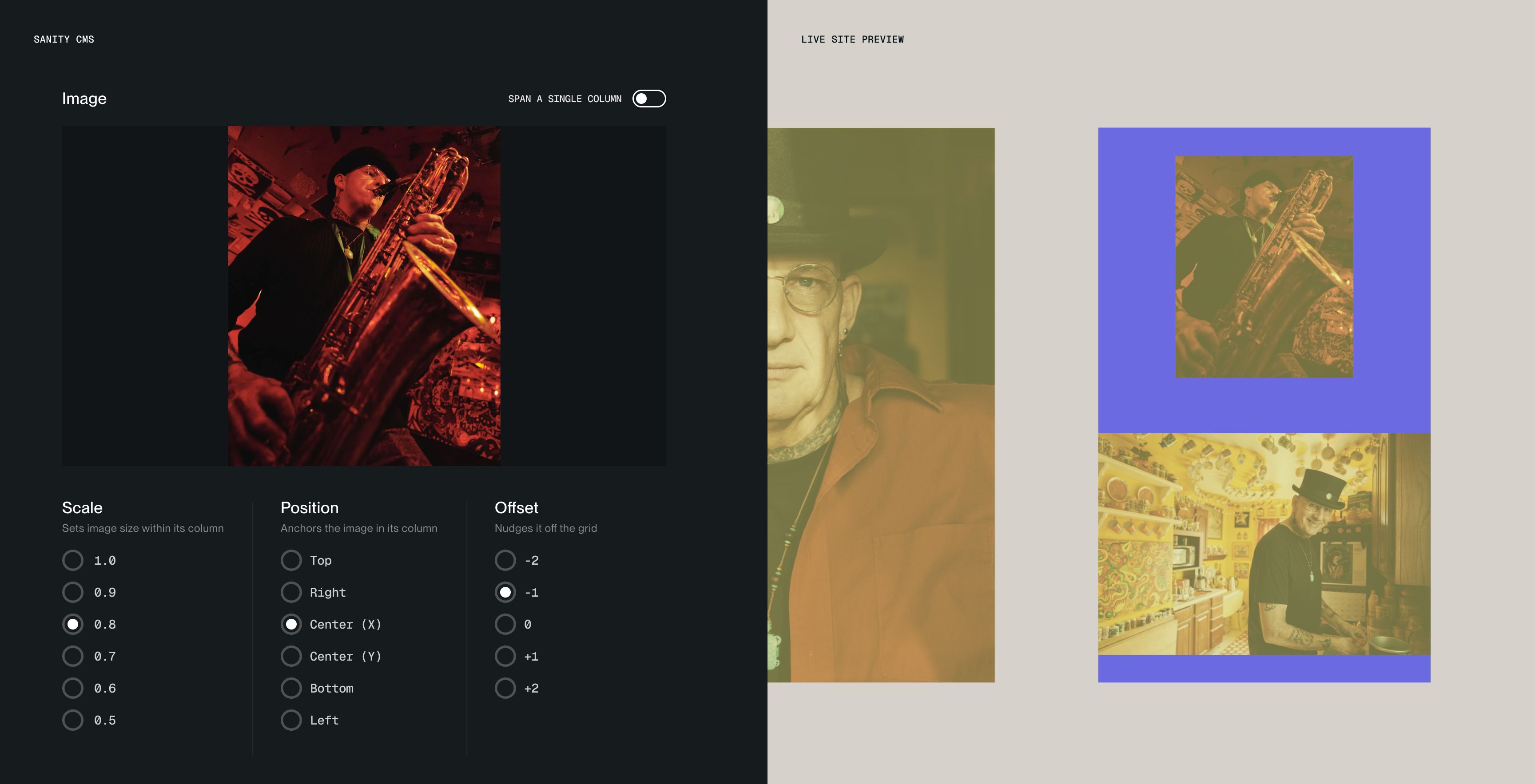
Simple controls in Sanity, paired with a grid preview on the live site, let Clayton compose every spread himself, no developer required.
Typography & Index
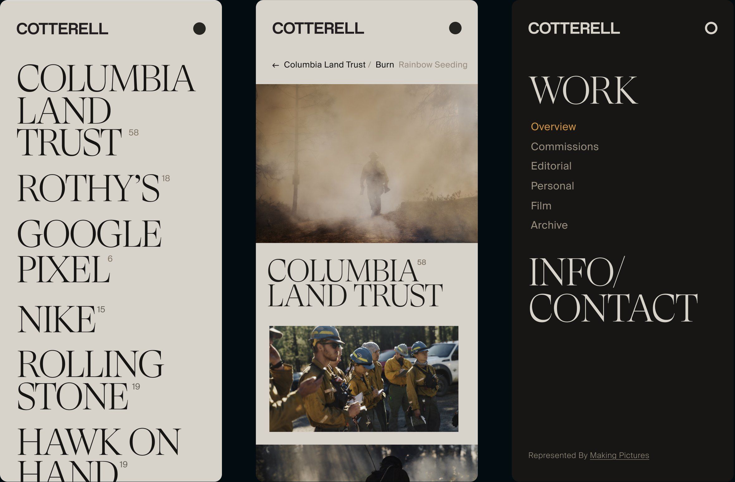
The overview page puts clients and projects front and center in a big editorial serif, set like the table of contents of a book. It’s confident, a little unexpected and gets you into the work fast. Everything else stays quiet and warm so the photos always do the talking.
Mobile
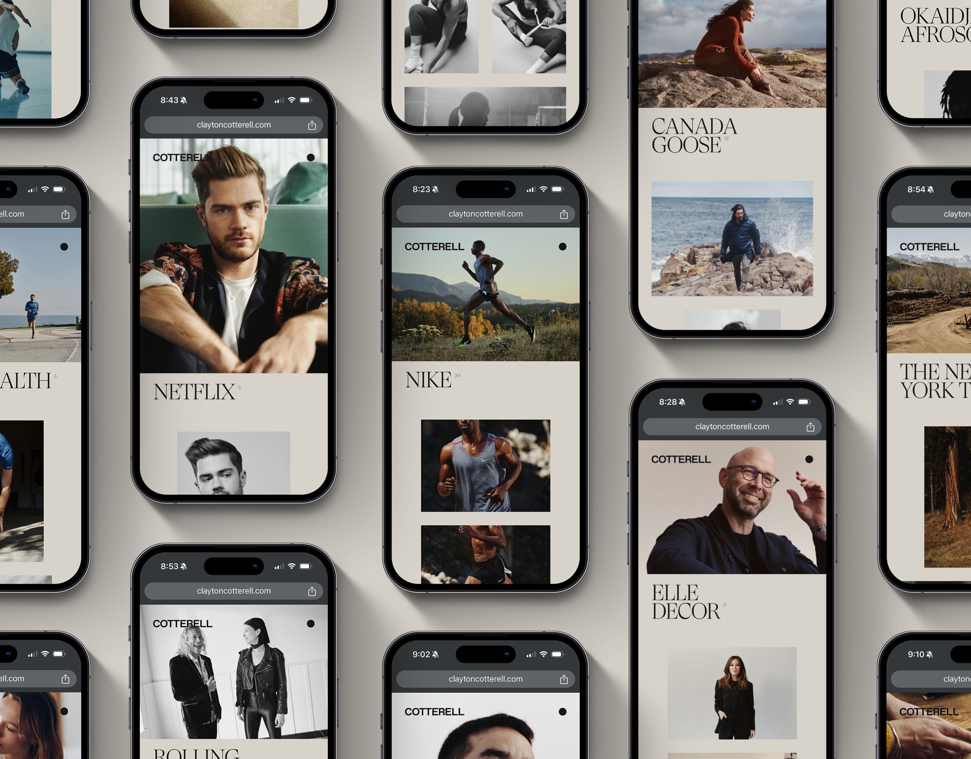
Most people find Clayton on their phones, so mobile needed the same care as desktop. The horizontal spreads turn into a vertical scroll that keeps the same rhythm, mixing big moments with smaller details so a project still feels just as considered on a phone. The editorial serif carries over as a bold, tappable index, and a simple full-screen menu keeps his work and contact info one tap away.
Midnight Sea Team
- Executive Creative Director & Designer
- Chad Tafolla
- Strategy Director
- Heather Tafolla
- Front & Backend Development
- Keith Driessen